🎨 ColorPickerView implements getting HSV colors, ARGB values, Hex color codes from any image drawables or your gallery pictures by tapping on the desired color. It also supports alpha & brightness slider bar, dialog, and saving & restoring selected data.


Add below codes to your root build.gradle file (not your module build.gradle file).
allprojects {
    repositories {
        mavenCentral()
    }
}
And add a dependency code to your module's build.gradle file.
dependencies {
    implementation "com.github.skydoves:colorpickerview:2.2.4"
}
Snapshots of the current development version of ColorPickerView are available, which track the latest versions.
repositories {
   maven {
     url 'https://oss.sonatype.org/content/repositories/snapshots/'
   }
}
- ColorPickerView in layout
- ColorListener
- Palette
- ActionMode
- Debounce
- Create using builder
- Restore and save state
-
Palette from Gallery
2. AlphaSlideBar
3. BrightnessSlideBar
4. ColorPickerDialog
5. FlagView
6. AlphaTileView
7. ColorPickerView Methods
8. Other Libraries
Add following XML namespace inside your XML layout file.
xmlns:app="http://schemas.android.com/apk/res-auto"We can use ColorPickerView without any customized attributes.
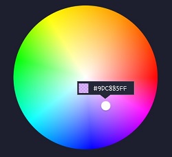
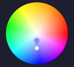
This ColorPickerView will be initialized with the default HSV color palette and default selector.
<com.skydoves.colorpickerview.ColorPickerView
   android:id="@+id/colorPickerView"
   android:layout_width="300dp"
android:layout_height="300dp" />We can customize the palette image and selector or various options using the below attributes.
app:palette="@drawable/palette" // sets a custom palette image.
app:selector="@drawable/wheel" // sets a custom selector image.
app:selector_size="32dp" // sets a width & height size of the selector.
app:alpha_selector="0.8" // sets an alpha of thr selector.
app:alpha_flag="0.8" // sets an alpha of the flag.
app:actionMode="last" // sets action mode 'always' or 'last'.
// set an initial position of the selector using a specific color. This attribute will work with only a default HSV palette.
app:initialColor="@color/colorPrimary"
app:preferenceName="MyColorPicker" // sets a preference name.
app:debounceDuration="200" // sets a debounce duration of the invoking color listener.
ColorListener is invoked when tapped by a user or selected a position by a function.
colorPickerView.setColorListener(new ColorListener() {
    @Override
    public void onColorSelected(int color, boolean fromUser) {
        LinearLayout linearLayout = findViewById(R.id.linearLayout);
        linearLayout.setBackgroundColor(color);
    }
});
ColorEnvelope is a wrapper class of color models for providing more variety of color models.
We can get HSV color value, Hex string code, ARGB value from the ColorEnvelope.
colorEnvelope.getColor() // returns a integer color.
colorEnvelope.getHexCode() // returns a hex code string.
colorEnvelope.getArgb() // returns a argb integer array.ColorEnvelopeListener extends ColorListener and it provides ColorEnvelope as a parameter.
colorPickerView.setColorListener(new ColorEnvelopeListener() {
    @Override
    public void onColorSelected(ColorEnvelope envelope, boolean fromUser) {
        linearLayout.setBackgroundColor(envelope.getColor());
        textView.setText("#" + envelope.getHexCode());
    }
});If we do not set any customized palette, the default palette drawable is the ColorHsvPalette.
We can move and select a point on the palette using a specific color using the below methods.
colorPickerView.selectByHsvColor(color);
colorPickerView.selectByHsvColorRes(R.color.colorPrimary);
We can change the default palette as a desired image drawable using the below method.
But if we change the palette using another drawable, we can not use the selectByHsvColor method.
colorPickerView.setPaletteDrawable(drawable);If we want to change back to the default palette, we can change it using the below method.
colorPickerView.setHsvPaletteDrawable();ActionMode is an option restrict to invoke the ColorListener by user actions.
colorPickerView.setActionMode(ActionMode.LAST); // ColorListener will be invoked when the finger is released.Only emits color values to the listener if a particular timespan has passed without it emitting using debounceDuration attribute.
We can set the debounceDuration on our xml layout file.
app:debounceDuration="150" Or we can set it programmatically.
colorPickerView.setDebounceDuration(150);This is how to create ColorPickerView's instance using ColorPickerView.Builder class.
ColorPickerView colorPickerView = new ColorPickerView.Builder(context)
      .setColorListener(colorListener)
      .setPreferenceName("MyColorPicker");
      .setActionMode(ActionMode.LAST)
      .setAlphaSlideBar(alphaSlideBar)
      .setBrightnessSlideBar(brightnessSlideBar)
      .setFlagView(new CustomFlag(context, R.layout.layout_flag))
      .setPaletteDrawable(ContextCompat.getDrawable(context, R.drawable.palette))
      .setSelectorDrawable(ContextCompat.getDrawable(context, R.drawable.selector))
.build();We can set an initial color and set positions of selector and slideBars based on the initial color.
This function will work only with a default HSV palette.
If we set preference name using the setPreferenceName method, this function will work only once.
app:initialColor="@color/colorPrimary"Or we can use this method programmatically.
.setInitialColor(color);
.setInitialColorRes(R.color.colorPrimary);This is how to restore the state of ColorPickerView.
setPreferenceName() method restores all of the saved states (selector, color) automatically.
colorPickerView.setPreferenceName("MyColorPicker");This is how to save the states of ColorPickerView.
setLifecycleOwner() method saves all of the states automatically when the lifecycleOwner is destroy.
colorPickerView.setLifecycleOwner(this);Or we can save the states manually using the below method.
ColorPickerPreferenceManager.getInstance(this).saveColorPickerData(colorPickerView);We can manipulate and clear the saved states using ColorPickerPreferenceManager.
ColorPickerPreferenceManager manager = ColorPickerPreferenceManager.getInstance(this);
manager.setColor("MyColorPicker", Color.RED); // manipulates the saved color data.
manager.setSelectorPosition("MyColorPicker", new Point(120, 120)); // manipulates the saved selector's position data.
manager.clearSavedAllData(); // clears all of the states.
manager.clearSavedColor("MyColorPicker"); // clears only saved color data.
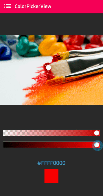
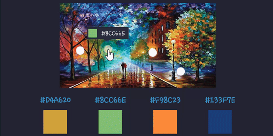
manager.restoreColorPickerData(colorPickerView); // restores the saved states manually.Here is how to get a bitmap drawable from the gallery image and set it to the palette.

Declare below permission on your AndroidManifest.xml file.
<uses-permission android:name="android.permission.READ_EXTERNAL_STORAGE"/>The below codes will start the Gallery and we can choose the desired image.
Intent photoPickerIntent = new Intent(Intent.ACTION_PICK);
photoPickerIntent.setType("image/*");
startActivityForResult(photoPickerIntent, REQUEST_CODE_GALLERY);
In the onActivityResult, we can get a bitmap drawable from the gallery and set it as the palette. And We can change the palette image of the ColorPickerView using the setPaletteDrawable method.
try {
  final Uri imageUri = data.getData();
  final InputStream imageStream = getContentResolver().openInputStream(imageUri);
  final Bitmap selectedImage = BitmapFactory.decodeStream(imageStream);
  Drawable drawable = new BitmapDrawable(getResources(), selectedImage);
  colorPickerView.setPaletteDrawable(drawable);
} catch (FileNotFoundException e) {
  e.printStackTrace();
}
AlphaSlideBar changes the transparency of the selected color.

AlphaSlideBar in XML layout
<com.skydoves.colorpickerview.sliders.AlphaSlideBar
   android:id="@+id/alphaSlideBar"
   android:layout_width="match_parent"
   android:layout_height="wrap_content"
   app:selector_AlphaSlideBar="@drawable/wheel" // sets a customized selector drawable.
   app:borderColor_AlphaSlideBar="@android:color/darker_gray" // sets a color of the border.
   app:borderSize_AlphaSlideBar="5"/> // sets a size of the border.
We can attach and connect the AlphaSlideBar to our ColorPickerView using attachAlphaSlider method.
AlphaSlideBar alphaSlideBar = findViewById(R.id.alphaSlideBar);
colorPickerView.attachAlphaSlider(alphaSlideBar);
We can make it vertically using the below attributes.
android:layout_width="280dp" // width must set a specific width size.
android:layout_height="wrap_content"
android:rotation="90"
BrightnessSlideBar changes the brightness of the selected color.
BrightnessSlideBar in XML layout
<com.skydoves.colorpickerview.sliders.BrightnessSlideBar
   android:id="@+id/brightnessSlide"
   android:layout_width="match_parent"
   android:layout_height="wrap_content"
   app:selector_BrightnessSlider="@drawable/wheel" // sets a customized selector drawable.
   app:borderColor_BrightnessSlider="@android:color/darker_gray" // sets a color of the border.
   app:borderSize_BrightnessSlider="5"/> // sets a size of the border.
We can attach and connect the BrightnessSlideBar to our ColorPickerView using attachBrightnessSlider method.
BrightnessSlideBar brightnessSlideBar = findViewById(R.id.brightnessSlide);
colorPickerView.attachBrightnessSlider(brightnessSlideBar);
We can make it vertically using the below attributes.
android:layout_width="280dp" // width must set a specific width size.
android:layout_height="wrap_content"
android:rotation="90"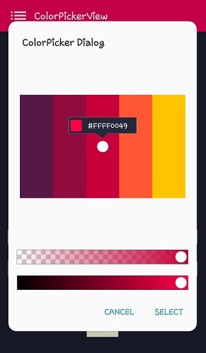
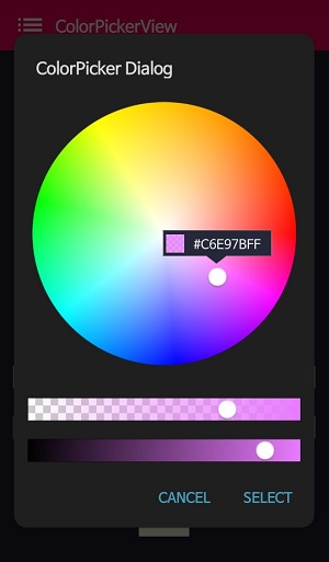
ColorPickerDialog can be used just like an AlertDialog and it provides colors by tapping from any drawable.
new ColorPickerDialog.Builder(this)
      .setTitle("ColorPicker Dialog")
      .setPreferenceName("MyColorPickerDialog")
      .setPositiveButton(getString(R.string.confirm),
          new ColorEnvelopeListener() {
              @Override
              public void onColorSelected(ColorEnvelope envelope, boolean fromUser) {
                  setLayoutColor(envelope);
              }
          })
       .setNegativeButton(getString(R.string.cancel),
          new DialogInterface.OnClickListener() {
              @Override
              public void onClick(DialogInterface dialogInterface, int i) {
                  dialogInterface.dismiss();
              }
           })
      .attachAlphaSlideBar(true) // the default value is true.
      .attachBrightnessSlideBar(true)  // the default value is true.
      .setBottomSpace(12) // set a bottom space between the last slidebar and buttons.
      .show();
we can get an instance of ColorPickerView from the ColorPickerView.Builder and we can customize it.
ColorPickerView colorPickerView = builder.getColorPickerView();
colorPickerView.setFlagView(new CustomFlag(this, R.layout.layout_flag)); // sets a custom flagView
builder.show(); // shows the dialogWe can implement showing a FlagView above and below on the selector.
This library provides BubbleFlagView by default as we can see the previews.
Here is the example code for implementing it.
BubbleFlag bubbleFlag = new BubbleFlag(this);
bubbleFlag.setFlagMode(FlagMode.FADE);
colorPickerView.setFlagView(bubbleFlag);
We can also fully customize the FlagView like below.
First, We need a customized layout like below.
<?xml version="1.0" encoding="utf-8"?>
<LinearLayout xmlns:android="http://schemas.android.com/apk/res/android"
    xmlns:tools="http://schemas.android.com/tools"
    android:layout_width="100dp"
    android:layout_height="40dp"
    android:background="@drawable/flag"
    android:orientation="horizontal">

    <LinearLayout
        android:id="@+id/flag_color_layout"
        android:layout_width="20dp"
        android:layout_height="20dp"
        android:layout_marginTop="6dp"
        android:layout_marginLeft="5dp"
        android:orientation="vertical"/>

    <TextView
        android:id="@+id/flag_color_code"
        android:layout_width="wrap_content"
        android:layout_height="wrap_content"
        android:layout_marginTop="6dp"
        android:layout_marginLeft="10dp"
        android:layout_marginRight="5dp"
        android:textSize="14dp"
        android:textColor="@android:color/white"
        android:maxLines="1"
        android:ellipsize="end"
        android:textAppearance="?android:attr/textAppearanceSmall"
        tools:text="#ffffff"/>
</LinearLayout>
Second, we need to create a class that extends FlagView. Here is an example code.
public class CustomFlag extends FlagView {

    private TextView textView;
    private AlphaTileView alphaTileView;

    public CustomFlag(Context context, int layout) {
        super(context, layout);
        textView = findViewById(R.id.flag_color_code);
        alphaTileView = findViewById(R.id.flag_color_layout);
    }

    @Override
    public void onRefresh(ColorEnvelope colorEnvelope) {
        textView.setText("#" + colorEnvelope.getHexCode());
        alphaTileView.setPaintColor(colorEnvelope.getColor());
    }
}
And last, set the FlagView to the ColorPickerView using the setFlagView method.
colorPickerView.setFlagView(new CustomFlag(this, R.layout.layout_flag));FlagMode is an option to decides the visibility action of the FlagView.
colorPickerView.setFlagMode(FlagMode.ALWAYS); // showing always by tapping and dragging.
colorPickerView.setFlagMode(FlagMode.LAST); // showing only when finger released.
AlphaTileView visualizes ARGB colors over the view.
If we need to represent ARGB colors on the general view, it will not be showing accurately. Because a color will be mixed with the parent view's background color. so if we need to represent ARGB colors accurately, we can use the AlphaTileView.
<com.skydoves.colorpickerview.AlphaTileView
     android:id="@+id/alphaTileView"
     android:layout_width="55dp"
     android:layout_height="55dp"
     app:tileSize="20" // the size of the repeating tile
     app:tileEvenColor="@color/tile_even" // the color of even tiles
app:tileOddColor="@color/tile_odd"/> // the color of odd tiles| Methods | Return | Description |
|---|---|---|
| getColor() | int | gets the last selected color. |
| getColorEnvelope() | ColorEnvelope | gets the ColorEnvelope of the last selected color. |
| setPaletteDrawable(Drawable drawable) | void | changes palette drawable manually. |
| setSelectorDrawable(Drawable drawable) | void | changes selector drawable manually. |
| setSelectorPoint(int x, int y) | void | selects the specific coordinate of the palette manually. |
| selectByHsvColor(@ColorInt int color) | void | changes selector's selected point by a specific color. |
| selectByHsvColorRes(@ColorRes int resource) | void | changes selector's selected point by a specific color using a color resource. |
| setHsvPaletteDrawable() | void | changes the palette drawable as the default drawable (ColorHsvPalette). |
| selectCenter() | void | selects the center of the palette manually. |
| setInitialColor(@ColorInt int color) | void | changes selector's selected point by a specific color initially. |
| setInitialColorRes(@ColorRes int resource) | void | changes selector's selected point by a specific color initially using a color resource. |
| setActionMode(ActionMode) | void | sets the color listener's trigger action mode. |
| setFlagView(FlagView flagView) | void | sets FlagView on ColorPickerView. |
| attachAlphaSlider | void | linking an AlphaSlideBar on the ColorPickerView. |
| attachBrightnessSlider | void | linking an BrightnessSlideBar on the ColorPickerView. |
Here are other ColorPicker related libraries!
A library that let you implement ColorPickerView, ColorPickerDialog, ColorPickerPreference.
You can get colors using multi selectors.
At here you can get a more specialized library on multi-coloring.
Support it by joining stargazers for this repository. ⭐
And follow me for my next creations! 🤩
