Identify and visualize trends related to a country’s performance in the Winter Olympic games on an interactive dashboard (view here).
This project was built as an extension of another project (focused on the Extract-Transform-Load process), which you can view here. The original data was downloaded as csv files from Kaggle and the World Bank, before being cleaned using Python and relevant libraries such as Pandas, and pushed to a Postgres database using SQLAlchemy.
The newly cleaned csv files were then taken and converted into a SQLite database for this project. SQLite was used for a more efficient connection, rather than connecting directly to the Postgres database and remapping the tables. After connecting to the database with SQLAlchemy, further cleaning was done using Python inside Jupyter Notebook to format the data to the structure necessary for this analysis before returning the data as a JSON.
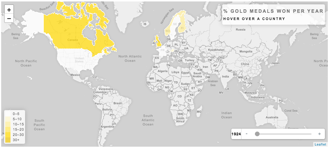 We first wanted a larger overview of general country performance, “Which countries score the most gold medals?” To visualize this, a choropleth map was made using
 Leaflet.js and geoJSON to represent the percentage of gold medals won by each country out of all available gold medals each year. We focused on gold medals for this map because we thought it was most representative of Olympic success. We found that successful countries tend to be those with colder climates (such as Russia or Norway), suggesting that monetary wealth is not the only indicator of success. Future analysis would look into climate as well as elevation and compare performance each year of the games to the location of the games. Do games held at higher elevation have an effect on a country’s performance?
 After getting a sense of the general top performers in the Winter Olympics, a scatter plot was made to look at the relationship between medals won, and GDP per capita. Using
 chart.js, markers were grouped by medal type and colored appropriately, and the radius set to represent GDP. The expectation was to see larger circles higher up the y-axis, which represented the total count of medals. However, the markers highest up the y-axis, were not the same markers with the largest radii. This again signaled that GDP may not be as influential as initially assumed. Future analyses would look for any shared attributes between highest performing countries and compare that to any shared attributes between countries with higher GDP. What do strong Olympic performing countries have in common? What do richer countries have in common? How do those two groups relate or differ to one another?
 For a more granular view, a line graph was made using
 plotly.js to look at individual country performance, analyzing the relationship between relative population size and percentage of medals won. A country’s relative population size was calculated by dividing said country’s population over the sum population of all countries that medaled in a given year. This means that only countries that won medals were taken into consideration. If a country did not win any medals in a specified year, their population data was not used. The assumption was that a country with more competing athletes would then also win more medals. Total world population was not used as it was not the best representation of who competes in the Winter Olympics.
Though no strong correlation was found between population and medals, there were some interesting trends. China had a consistently high relative population (53-56%) and yet only won 1-3% of available medals. Norway on the other hand, had a consistently low relative population (less than 1%) and yet performed at a consistently high level. Again, pointing to the idea that perhaps climate is a stronger indicator of performance.
This interactive dashboard was designed using HTML/CSS and JavaScript, including libraries such as Bootstrap 4, Plotly.js, Chart.js, and Leaflet.js, and deployed on Heroku so that users could view the project without needing to start a server. View the project here.
