🏄 surfs_up
Module 9 - SQLite & SQLAlchemy & Flask Describe the key differences in weather between June and December for the island of Oahu and make two recommendations for further analysis.
1️⃣ Overview
The goal of this analysis is to investigate temperature variations on the Hawaiian island of Oahu in order to determine the viability of a business that combines the sale of surfing products with the sale of milkshakes and ice cream. Surf 'n Shake will be the name of the store. The data will be used to persuade local investors to join forces in the creation of this business.
Mr. W. Avy, the lead investor, provided us with a flat database in sqlite format containing temperature data recorded by several weather observation stations located at various points throughout the Hawaiian Islands from 2010 to 2017. Following a meeting with Mr. W. Avy, it was decided to limit the analysis to the months of June and December and to the island of Oahu as the starting point for a potential Surf 'n Shake business chain.
Mr. W. Avy wants to know if the temperature will be high enough during those two months to keep the flow of tourists strong and the business profitable. In theory, if the temperature makes Oahu attractive for tourists during the hottest month (June) and the coldest month (December), there should be enough customers to make the business profitable throughout the year.
2️⃣ Results
The SQLite database recieved from W. Avy contains two tables: measurement and station. The measurement table has 19550 records, which were filtered using code to focus only on the records from the months of June and December of each year. The table station contains only 9 records, corresponding to the data of the weather stations located in the Hawaiian archipielago.
The complete code used for this analysis can be found here. Below is a snippet of the code used for extracting the temperatures for the month of June.
# 1. Import the sqlalchemy extract function.
from sqlalchemy import extract

# 2. Write a query that filters the Measurement table to retrieve the temperatures for the month of June.
june_results = session.query(Measurement.date, Measurement.tobs).\
    filter(extract('month', Measurement.date)==6)
print(june_results)
Similarly, below is the code used for filtering the information for the month of December.
# 6. Write a query that filters the Measurement table to retrieve the temperatures for the month of December.
december_results = session.query(Measurement.date, Measurement.tobs).\
    filter(extract('month', Measurement.date)==12)
print(december_results)
+ Note: Click or Tap on any image to zoomImage 1: Screenshot of the measurement table without any filters
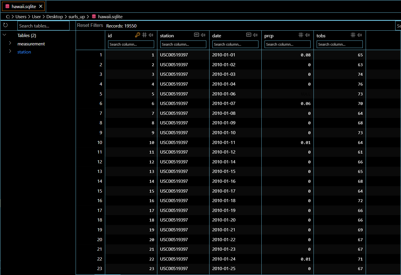
Image 2: Screenshot of the station table

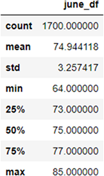
Once the temperature information for the months of June and December was filtered, the Pandas function describe() was used to calculate the main statistical parameters of the June and December data.
💠 Deliverable #1 The statistical description for June is shown below.
The data for June has 1700 entries or lines. The mean temperature for June in Oahu is 74.9 F, but it can go as low as 64 F and as high as 85 F, so there is a 20 degree range variation in the historical data.
Image 3: Statistical description of the DataFrame with the temperatures for the month of June
💠 Deliverable #2 The statistical description for December is shown below.
Using the same procedure described above, the data for December has 1517 data points. The mean temperature for December in Oahu is 71.04 F. The minimum temmperature registred durung the period is 56 F and the maximum is 83 F. In this case the difference between the two extremes is 27.
Image 4: Statistical description of the DataFrame with the temperatures for the month of December
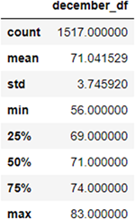
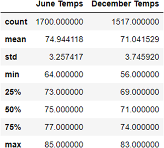
Image 5: Comparison of the statistical description of the DataFrame with the temperatures for the months of June and December
3️⃣ Summary
At first sight, and based on the mean temperature data, it looks like the island of Oahu is a perfect place to visit as a tourist. The mean temperature in summer (June) is about 75 F and during winter (December) it drops to 71 F. That is about the same temperature that most air conditioning units keep inside a house, so the conditions look favorable for the business. However, before jumping into conclusions it is advisable to take a closer look at the data, so two additional queries were done:
1. A histogram plot to visualize if the data is skewed
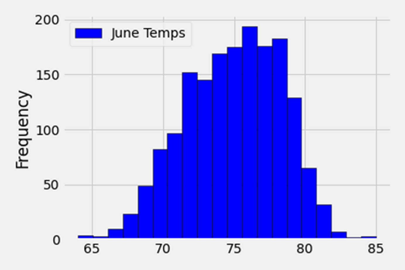
Below is the histogram chart for the temperatures during the month of June. It looks like the data is skewed to the right and for the most part the temperature during June oscillates between 71 F and 79 F. From the graph, the frequency of days with extreme temperatures (either cold or hot) during June seems low, so June should not be a problem for the Surf 'n Shake business.
Image 6: Histogram of the temperatures during June
In the same manner, the December histogram is shown below. The graph shows that the temperature in December usually ranges between 66 F and 76 F, but there are many days in December when the temperature stays around 72 F. Extreme temperature days are uncommon in December when compared to the central block of the graph. The data looks slightly skewed to the right, but not nearly as much as in the June graph.
Image 7: Histogram of the temperatures during December

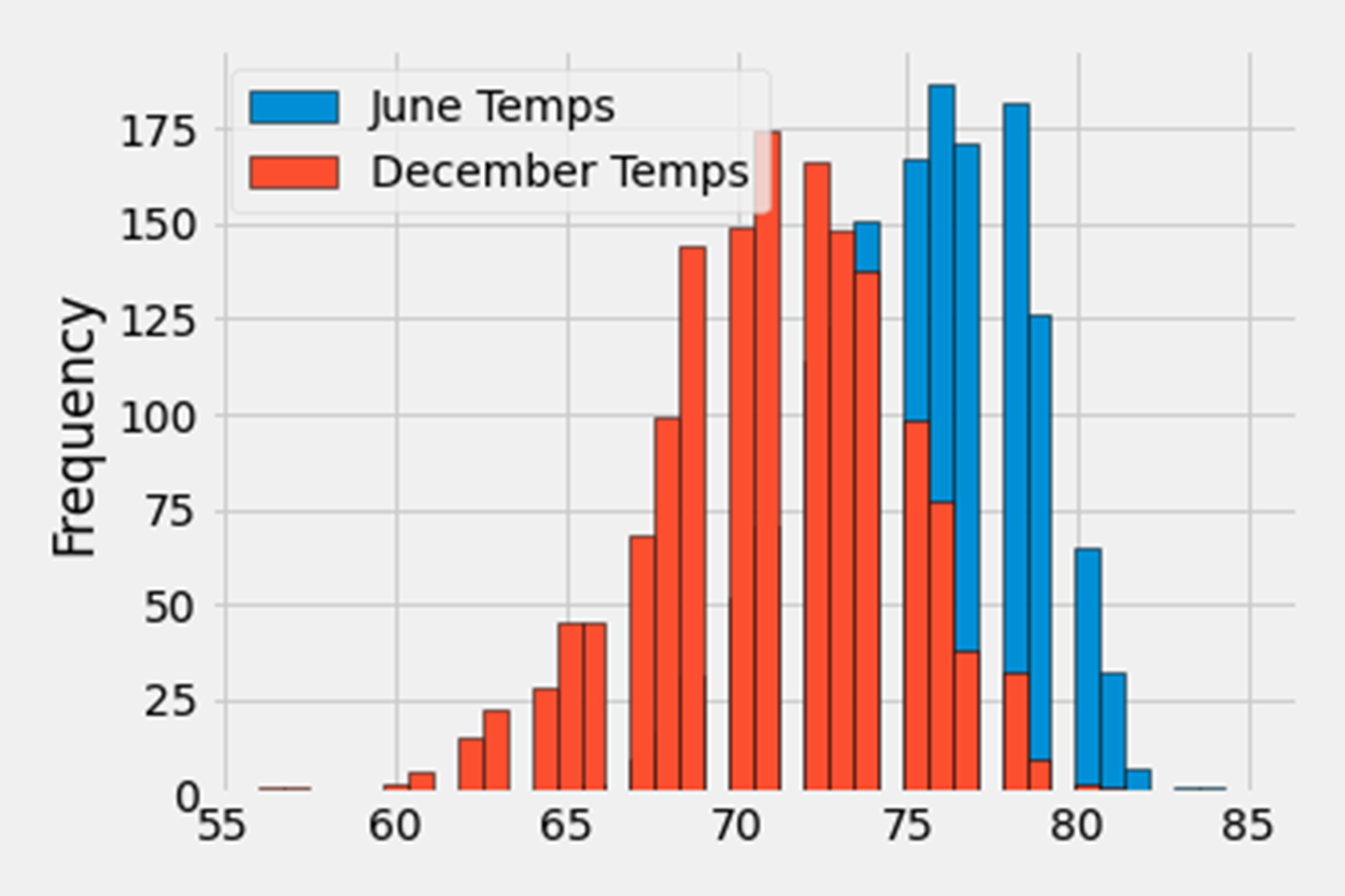
To conclude the section on histograms, we show the histograms for June and December superimposed below. This chart illustrates that the June data is significantly skewed to the right than the December data. Most of the temperatures recorded in those two months are between 66 F and 77 F, indicating that the temperature does not appear to be a barrier to tourists visiting Oahu.
Image 8: Histogram of the temperatures during June and December superimposed
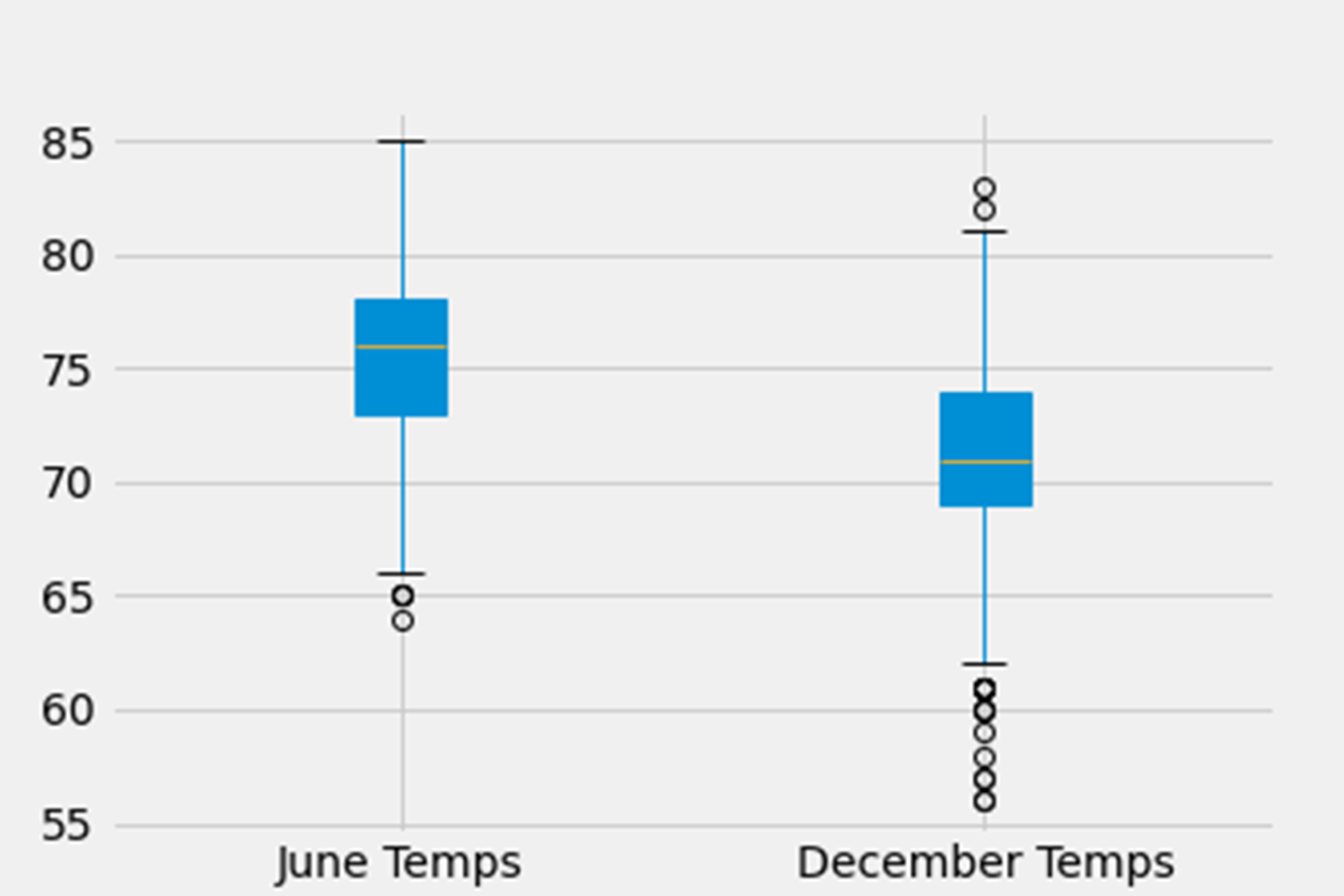
2. A boxplot to check for possible outliers
As a final check, we will show a Boxplot (Box-and-Whisker Plot) for the June and December temperature readings. This type of chart is useful for confirming data consistency and identifying outlier data points.
Image 10 below confirms that the data for June is skewed to the right. The box for December, on the other hand, appears to indicate that the data for that month is skewed to the left, contrary to what the histogram suggested. This means that the month of June is frequently hotter than the average temperature calculation indicates. In December, there appears to be a slight prevalence of 'cold' days.
Concerning outliers, the graph shows that there is no outlier data that exceeds the chart's upper limit for June and only a few points are at the lower limit.
The situation is different in December. We have a few points that exceed the upper limit and many points that fall below the lower limit.
We should note that boxplots have a limitation. The points shown in boxplots only try to represent the data, and the actual situation may differ from what is shown. Just because the graph shows only two points as outliers do not imply that the data contains only two points. There may be many outlier points in the data, but they are so close together that they appear as one point on the boxplot.
To be certain of the number of outlier points each month, we need to count how many data points are outliers and their weight in relation to the total sample data.
A brief review of the values that make up a boxplot helps to better understand what we are trying to describe:
Image 9: Different parts of a Boxplot

Using the .describe() function for June and December we obtained the following data:
Q1 for June = 75
Q3 for June = 77
Q1 for December = 69
Q3 for December = 74
The following snippet of code shows how the number of outliers was calculated for June
# Counting the number of outliers for June
# Calculating the Inter Quartile Range (IQR) and Whiskers values for June and December
Q1_June = 75
Q3_June = 77
IQR_June = Q3_June - Q1_June # (3rd Quartile - 1st Quartile)

# Value of the upper Whisker for June
Upper_Bound_June = Q3_June + 1.5*IQR_June
# Value of the lower Whisker for June
Lower_Bound_June = Q1_June - 1.5*IQR_June

# For June
low_outliers_june = june_df[june_df['June Temps'] < Lower_Bound_June]
high_outliers_june = june_df[june_df['June Temps'] > Upper_Bound_June]
The code for the month of December is nearly identical, so it is not worth including it here.
After running the code, we obtain the following:
Total datapoints for June = 1700
Count of Low Outliers in June = 268 or 268/1700 = 15.8% of the data 16% is a high value, so the right skewness is confirmed...again.
Count of High Outliers in June = 44 or 44/1700 = 2.6% of the data
Total datapoints for December = 1517
Count of Low Outliers in December = 15 or 15/1517 = 0.98% of the data
Count of High Outliers in December = 2 or 2/1517 = 0.1% of the data
As we can see, even though the Boxplot for December seemed to suggest that there were a lot of outliers datapoints for that month, the count of such points reveal that it was not the case, and so the temperature readings in December are pretty consistent year after year. As a contrast, the Boxplot for June shows few outliers, but once we count them, we see that almost 20% of the points are outliers, and so it confirms the suspicion that the month of June tends to be hotter than what the .describe() function suggest.
In conclusion:
After carefully reviewing the data, we can confidently state that summers on Oahu are nice, and winters are slightly cooler, but not cold enough to make going to the beach unpleasant.
None of the above suggest that the temperature differences between June and December will be a reason for tourists not coming to Oahu, so the Surf 'N Shake project has passed the initial evaluation.
Image 10: Box-and-Whisker Plot of the temperatures during June and December
References
Module 9: Exploring Weather Data, https://courses.bootcampspot.com/courses/1145/pages/9-dot-0-1-exploring-weather-data, ©️ 2020-2021 Trilogy Education Services, Web 15 Apr 2022.
Boxplot (or Box-and-Whisker Plot) - Missouri State University, http://people.missouristate.edu/songfengzheng/Teaching/MTH545/Notes03.pdf
Save a Pandas dataFrame As An Image, https://predictivehacks.com/?all-tips=save-a-pandas-dataframe-as-an-image
Display df.describe() Output In A Dataframe, https://support.sisense.com/kb/en/article/display-dfdescribe-output-in-a-dataframe
Understanding Boxplots, https://towardsdatascience.com/understanding-boxplots-5e2df7bcbd51
