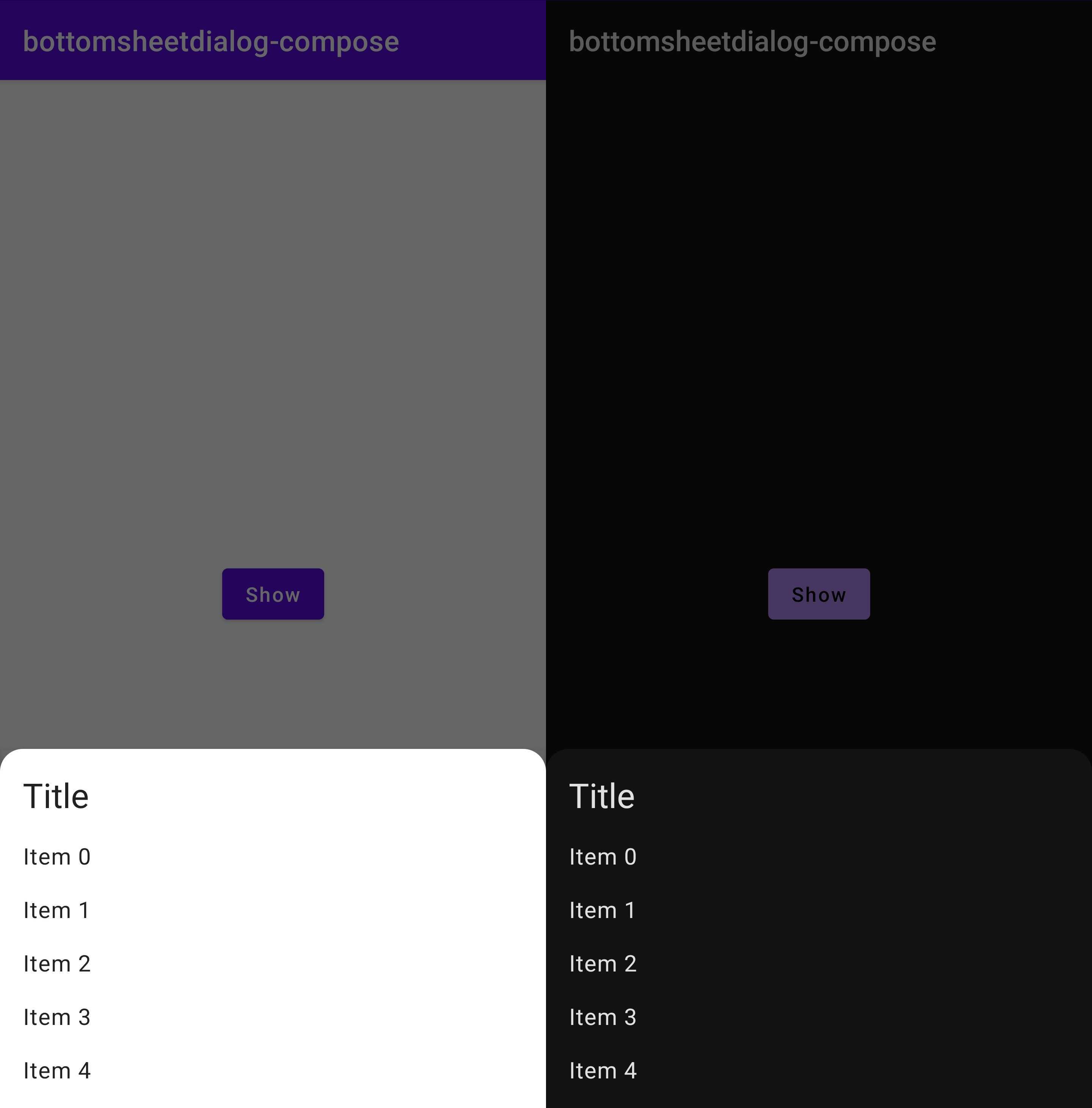
Jetpack Compose BottomSheetDialog library that allows you to use BottomsheetDialog like Dialog's interface.
Also, it supports to set navigation bar color when BottomSheetDialog has shown.

| Compose | Library |
|---|---|
| Compose 1.3.x |  |
| Compose 1.4.x |  |
| Compose 1.5.x |  |
| Compose 1.6.x |  |
| Compose 1.7.x |  |
// module's build.gradle
dependencies {
    implementation "com.holix.android:bottomsheetdialog-compose:{version}"
}You can use BottomSheetDialog composable like Dialog composable! It is super simple 😎
@Composable
fun YourComposable() {
    var show by remember {
        mutableStateOf(false)
    }
    if (show) {
        BottomSheetDialog(
            onDismissRequest = {
                show = false
            },
            properties = BottomSheetDialogProperties(
                ...
            )
        ) {
            // content
            Surface {
                ...
            }
        }
    }
}
| name | default value | type |
|---|---|---|
| dismissOnBackPress | true | Boolean |
| dismissOnClickOutside | true | Boolean |
| dismissWithAnimation | false | Boolean |
| enableEdgeToEdge | false | Boolean |
| navigationBarProperties | NavigationBarProperties() | NavigationBarProperties |
| behaviorProperties | BottomSheetBehaviorProperties() | BottomSheetBehaviorProperties |
inspired by accompanist's SystemUiController
| name | default value | type |
|---|---|---|
| color | Color.Unspecified | Color |
| darkIcons | color.luminance() > 0.5f | Boolean |
| navigationBarContrastEnforced | true | Boolean |
| transformColorForLightContent | { original -> Color(0f, 0f, 0f, 0.3f).compositeOver(original) } | (Color) -> Color |
BottomSheetBehavior official docs
| name | default value | type |
|---|---|---|
| state | State.Collapsed | State |
| maxWidth | Size.NotSet | Size |
| maxHeight | Size.NotSet | Size |
| isDraggable | true | Boolean |
| expandedOffset | 0 | Integer |
| halfExpandedRatio | 0.5F | Float |
| isHideable | true | Boolean |
| peekHeight | PeekHeight.Auto | PeekHeight |
| isFitToContents | true | Boolean |
| skipCollapsed | false | Boolean |
| isGestureInsetBottomIgnored | false | Boolean |
- This library depends on material-components-android(BottomSheetDialog).
Designed and developed by 2022 holixfactory

Licensed under the Apache License, Version 2.0 (the "License");
you may not use this file except in compliance with the License.
You may obtain a copy of the License at

   http://www.apache.org/licenses/LICENSE-2.0

Unless required by applicable law or agreed to in writing, software
distributed under the License is distributed on an "AS IS" BASIS,
WITHOUT WARRANTIES OR CONDITIONS OF ANY KIND, either express or implied.
See the License for the specific language governing permissions and
limitations under the License.
