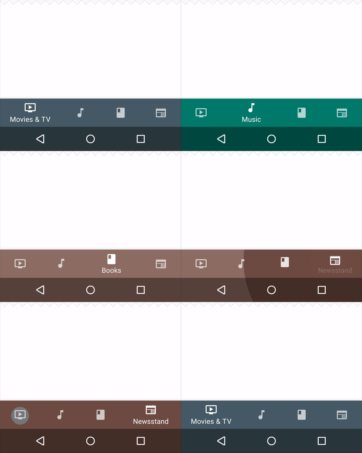
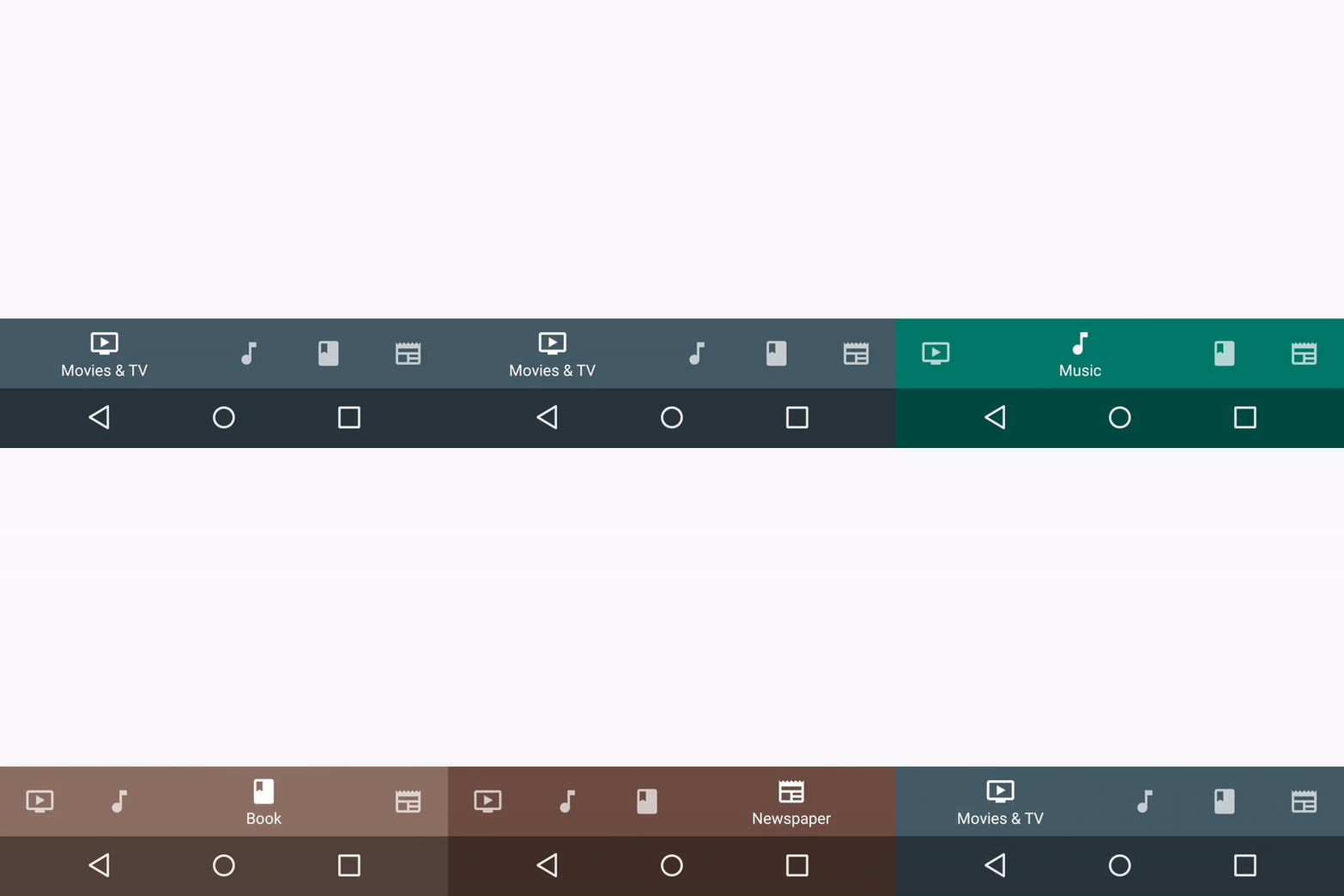
Build a BottomNavigationView with a circular color reveal animation like in Material Design guidelines demos.
This library does not implement its own BottomNavigationView but uses the one from the Android Support Library.
Check Material Design Guidelines to see details about Bottom Navigation.
dependencies {

    // Declare the design package of Android Support Library to include the BottomNavigationView
    implementation "com.android.support:design:${ANDROID_SUPPORT_LIBRARY_VERSION}"

    // Declare the 'BottomNavigationCircularColorReveal' component
    implementation "re.robz.android:bottom-navigation-circular-color-reveal:1.0.0"

}You can look at the sample app to see it in action.
Define the menu for the BottomNavigationView
<?xml version="1.0" encoding="utf-8"?>
<menu xmlns:android="http://schemas.android.com/apk/res/android">
    <item android:id="@+id/menu_videos"
        android:title="@string/menu_videos"
        android:icon="@drawable/ic_video" />
    <item android:id="@+id/menu_music"
        android:title="@string/menu_music"
        android:icon="@drawable/ic_music" />
    <item android:id="@+id/menu_books"
        android:title="@string/menu_books"
        android:icon="@drawable/ic_book" />
    <item android:id="@+id/menu_newspaper"
        android:title="@string/menu_newspaper"
        android:icon="@drawable/ic_newspaper" />
</menu>
Define the colors for your the BottomNavigationView
<array name="menu_colors">
    <item>#445A65</item>
    <item>#00796B</item>
    <item>#8C6E62</item>
    <item>#6E4C42</item>
</array>
Create your circular color reveal component and bind it to the BottomNavigationView
val colors = resources.getIntArray(R.array.menu_colors)

val reveal = BottomNavigationCircularColorReveal(colors)
reveal.setuptWithBottomNavigationView(bottomNavigationView)
The circular color reveal component uses its own BottomNavigationView.OnNavigationItemSelectedListener,
so if you want to define your custom behavior you can set your BottomNavigationView.OnNavigationItemSelectedListener on the reveal component.
reveal.setOnNavigationItemSelectedListener {
    // Do your custom operations on item selection here (e.g display a fragment)
    // ...
    // Allow selection
    true
}
To disable the reveal component, just unbind it
reveal.unbind()This librabry uses ViewAnimationUtils.createCircularReveal under the hood, which is available from Lollipop.
Versions before Lollipop will not use any animation but still look pretty good.
MIT License

Copyright (c) 2018 Jimmy Robz

Permission is hereby granted, free of charge, to any person obtaining a copy
of this software and associated documentation files (the "Software"), to deal
in the Software without restriction, including without limitation the rights
to use, copy, modify, merge, publish, distribute, sublicense, and/or sell
copies of the Software, and to permit persons to whom the Software is
furnished to do so, subject to the following conditions:

The above copyright notice and this permission notice shall be included in all
copies or substantial portions of the Software.

THE SOFTWARE IS PROVIDED "AS IS", WITHOUT WARRANTY OF ANY KIND, EXPRESS OR
IMPLIED, INCLUDING BUT NOT LIMITED TO THE WARRANTIES OF MERCHANTABILITY,
FITNESS FOR A PARTICULAR PURPOSE AND NONINFRINGEMENT. IN NO EVENT SHALL THE
AUTHORS OR COPYRIGHT HOLDERS BE LIABLE FOR ANY CLAIM, DAMAGES OR OTHER
LIABILITY, WHETHER IN AN ACTION OF CONTRACT, TORT OR OTHERWISE, ARISING FROM,
OUT OF OR IN CONNECTION WITH THE SOFTWARE OR THE USE OR OTHER DEALINGS IN THE
SOFTWARE.


