

This is a Kotlin MultiPlatform library that provides declarative UI and application screens management in common code. You can implement full application for Android and iOS only from common code with it.
| Android | iOS |
|---|---|
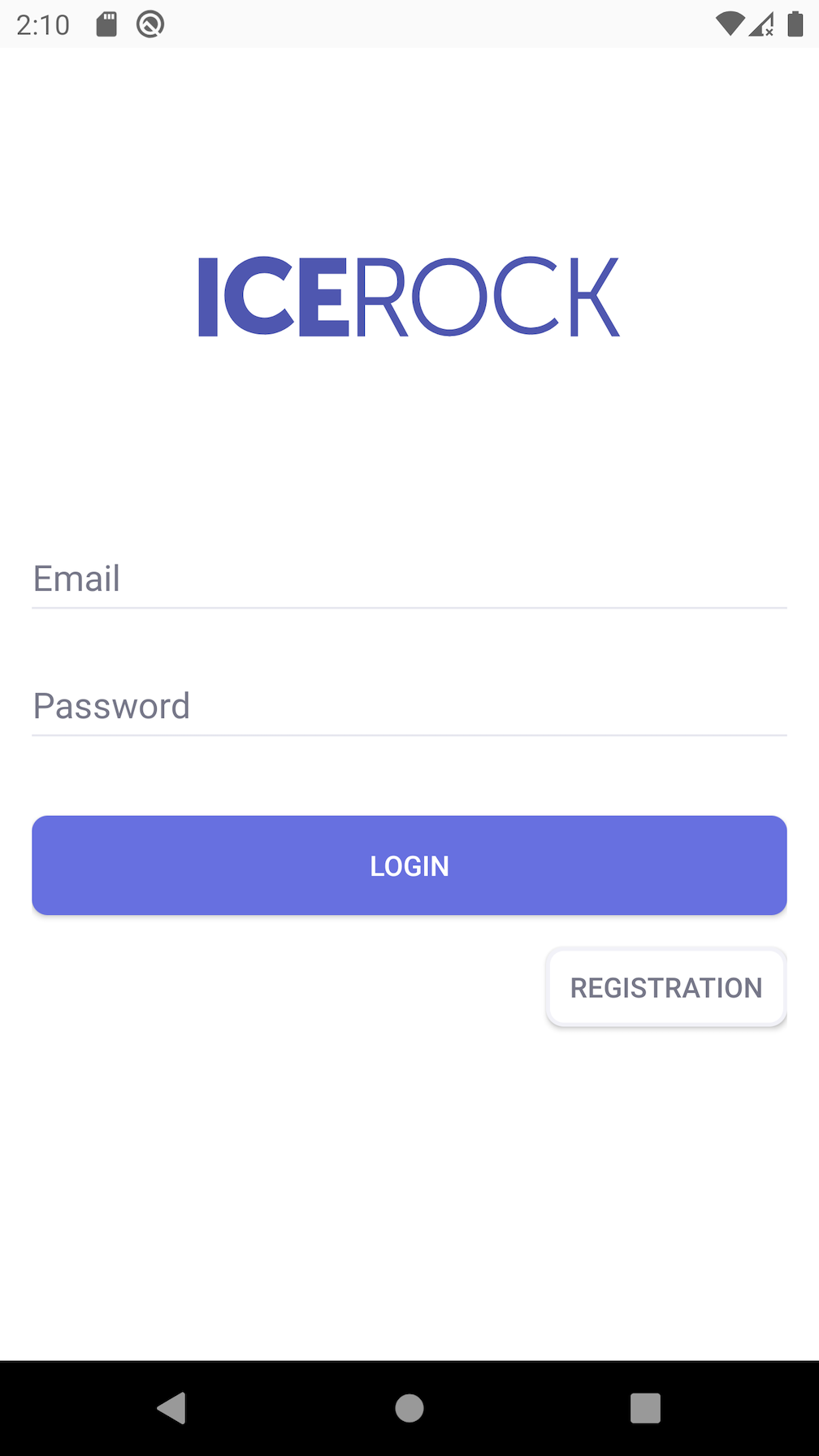 |
 |
Code of screen structure:
class LoginScreen(
    private val theme: Theme,
    private val loginViewModelFactory: () -> LoginViewModel
) : WidgetScreen<Args.Empty>() {

    override fun createContentWidget() = with(theme) {
        val viewModel = getViewModel(loginViewModelFactory)

        constraint(size = WidgetSize.AsParent) {
            val logoImage = +image(
                size = WidgetSize.Const(SizeSpec.WrapContent, SizeSpec.WrapContent),
                image = const(Image.resource(MR.images.logo)),
                scaleType = ImageWidget.ScaleType.FIT
            )

            val emailInput = +input(
                size = WidgetSize.WidthAsParentHeightWrapContent,
                id = Id.EmailInputId,
                label = const("Email".desc() as StringDesc),
                field = viewModel.emailField,
                inputType = InputType.PHONE
            )
            val passwordInput = +input(
                size = WidgetSize.WidthAsParentHeightWrapContent,
                id = Id.PasswordInputId,
                label = const("Password".desc() as StringDesc),
                field = viewModel.passwordField
            )
            val loginButton = +button(
                size = WidgetSize.Const(SizeSpec.AsParent, SizeSpec.Exact(50f)),
                content = ButtonWidget.Content.Text(Value.data("Login".desc())),
                onTap = viewModel::onLoginPressed
            )

            val registerButton = +button(
                id = Id.RegistrationButtonId,
                size = WidgetSize.Const(SizeSpec.WrapContent, SizeSpec.Exact(40f)),
                content = ButtonWidget.Content.Text(Value.data("Registration".desc())),
                onTap = viewModel::onRegistrationPressed
            )

            val copyrightText = +text(
                size = WidgetSize.WrapContent,
                text = const("IceRock Development")
            )

            constraints {
                passwordInput centerYToCenterY root
                passwordInput leftRightToLeftRight root offset 16

                emailInput bottomToTop passwordInput offset 8
                emailInput leftRightToLeftRight root offset 16

                loginButton topToBottom passwordInput
                loginButton leftRightToLeftRight root

                registerButton topToBottom loginButton
                registerButton rightToRight root

                // logo image height must be automatic ?
                logoImage centerXToCenterX root
                logoImage.verticalCenterBetween(
                    top = root.top,
                    bottom = emailInput.top
                )

                copyrightText centerXToCenterX root
                copyrightText bottomToBottom root.safeArea offset 8
            }
        }
    }

    object Id {
        object EmailInputId : InputWidget.Id
        object PasswordInputId : InputWidget.Id
        object RegistrationButtonId : ButtonWidget.Id
    }
}
Code of theme:
val loginScreen = Theme(baseTheme) {
    factory[ConstraintWidget.DefaultCategory] = ConstraintViewFactory(
        padding = PaddingValues(16f),
        background = Background(
            fill = Fill.Solid(Colors.white)
        )
    )

    factory[InputWidget.DefaultCategory] = SystemInputViewFactory(
        margins = MarginValues(bottom = 8f),
        underLineColor = Color(0x000000DD),
        underLineFocusedColor = Color(0x3949ABFF),
        labelTextStyle = TextStyle(
            size = 12,
            color = Color(0x3949ABFF),
            fontStyle = FontStyle.BOLD
        ),
        errorTextStyle = TextStyle(
            size = 12,
            color = Color(0xB00020FF),
            fontStyle = FontStyle.BOLD
        ),
        textStyle = TextStyle(
            size = 16,
            color = Color(0x000000FF),
            fontStyle = FontStyle.MEDIUM
        )
    )

    val corners = platformSpecific(android = 8f, ios = 25f)

    factory[ButtonWidget.DefaultCategory] = SystemButtonViewFactory(
        margins = MarginValues(top = 32f),
        background = {
            val bg: (Color) -> Background = {
                Background(
                    fill = Fill.Solid(it),
                    shape = Shape.Rectangle(
                        cornerRadius = corners
                    )
                )
            }
            StateBackground(
                normal = bg(Color(0x6770e0FF)),
                pressed = bg(Color(0x6770e0EE)),
                disabled = bg(Color(0x6770e0BB))
            )
        }.invoke(),
        textStyle = TextStyle(
            color = Colors.white
        )
    )

    factory[LoginScreen.Id.RegistrationButtonId] = SystemButtonViewFactory(
        background = {
            val bg: (Color) -> Background = {
                Background(
                    fill = Fill.Solid(it),
                    shape = Shape.Rectangle(
                        cornerRadius = corners
                    )
                )
            }
            StateBackground(
                normal = bg(Color(0xFFFFFF00)),
                pressed = bg(Color(0xE7E7EEEE)),
                disabled = bg(Color(0x000000BB))
            )
        }.invoke(),
        margins = MarginValues(top = 16f),
        textStyle = TextStyle(
            color = Color(0x777889FF)
        ),
        androidElevationEnabled = false
    )
}- compliance with platform rules;
- declare structure, not rendering;
- compile-time safety;
- reactive data handling.
- Gradle version 6.8+
- Android API 16+
- iOS version 11.0+
root build.gradle
allprojects {
    repositories {
        mavenCentral()
    }
}
project build.gradle
dependencies {
    commonMainApi("dev.icerock.moko:widgets:0.2.4")

    commonMainApi("dev.icerock.moko:widgets-bottomsheet:0.2.4") // show bottom sheets
    commonMainApi("dev.icerock.moko:widgets-collection:0.2.4") // collection widget
    commonMainApi("dev.icerock.moko:widgets-datetime-picker:0.2.4") // show datepicker
    commonMainApi("dev.icerock.moko:widgets-image-network:0.2.4") // images with load from url
    commonMainApi("dev.icerock.moko:widgets-sms:0.2.4") // input with sms autofill
    commonMainApi("dev.icerock.moko:widgets-media:0.2.4") // moko-media integration
    commonMainApi("dev.icerock.moko:widgets-permissions:0.2.4") // moko-permissions integration
}root build.gradle
buildscript {
    repositories {
        gradlePluginPortal()
    }

    dependencies {
        classpath "dev.icerock.moko.widgets:gradle-plugin:0.2.4"
    }
}
project build.gradle
apply plugin: "dev.icerock.mobile.multiplatform-widgets-generator" // must apply before kotlin-multiplatform pluginMultiplatform application definition at mpp-library/src/commonMain/kotlin/App.kt:
class App : BaseApplication() {
    override fun setup(): ScreenDesc<Args.Empty> {
        val theme = Theme()

        return registerScreen(HelloWorldScreen::class) { HelloWorldScreen(theme) }
    }
}
Screen definition mpp-library/src/commonMain/kotlin/HelloWorldScreen.kt:
class HelloWorldScreen(
    private val theme: Theme
) : WidgetScreen<Args.Empty>() {

    override fun createContentWidget() = with(theme) {
        container(size = WidgetSize.AsParent) {
            center {
                text(
                    size = WidgetSize.WrapContent,
                    text = const("Hello World!")
                )
            }
        }
    }
}
Result:
| Android | iOS |
|---|---|
 |
 |
Setup theme config:
val theme = Theme {
    factory[TextWidget.DefaultCategory] = SystemTextViewFactory(
        textStyle = TextStyle(
            size = 24,
            color = Colors.black
        ),
        padding = PaddingValues(padding = 16f)
    )
}
Result:
| Android | iOS |
|---|---|
 |
 |
class TimerScreen(
    private val theme: Theme
) : WidgetScreen<Args.Empty>() {
    override fun createContentWidget(): Widget<WidgetSize.Const<SizeSpec.AsParent, SizeSpec.AsParent>> {
        val viewModel = getViewModel { TimerViewModel() }

        return with(theme) {
            container(size = WidgetSize.AsParent) {
                center {
                    text(
                        size = WidgetSize.WrapContent,
                        text = viewModel.text
                    )
                }
            }
        }
    }
}

class TimerViewModel : ViewModel() {
    private val iteration = MutableLiveData<Int>(0)
    val text: LiveData<StringDesc> = iteration.map { it.toString().desc() }

    init {
        viewModelScope.launch {
            while (isActive) {
                delay(1000)
                iteration.value = iteration.value + 1
            }
        }
    }
}Please see more examples in the sample directory.
- The widgets directory contains the
widgetslibrary; - The widgets-bottomsheet directory contains the
widgets-bottomsheetlibrary; - The widgets-sms directory contains the
widgets-smslibrary; - The widgets-datetime-picker directory contains the
datetime-pickerlibrary; - The widgets-collection directory contains the
collectionlibrary; - The gradle-plugin directory contains the gradle-plugin which apply compiler plugins for Native and JVM;
- The kotlin-plugin directory contains the JVM compiler plugin with code-generation from @WidgetDef annotation;
- The kotlin-native-plugin directory contains the Native compiler plugin with code-generation from @WidgetDef annotation;
- The kotlin-common-plugin directory contains the common code of JVM and Native compiler plugins;
- The sample directory contains sample apps for Android and iOS; plus the mpp-library connected to the apps;
- For local testing a library use:
./publishToMavenLocal.shcd sample/ios-apppod install- sample apps priority use the locally published version
- run android from
Android Studio- moduleandroid-app, run iOS from xcode workspacesample/ios-app/ios-app.xcworkspace
All development (both new features and bug fixes) is performed in the develop branch. This way master always contains the sources of the most recently released version. Please send PRs with bug fixes to the develop branch. Documentation fixes in the markdown files are an exception to this rule. They are updated directly in master.
The develop branch is pushed to master on release.
For more details on contributing please see the contributing guide.
Copyright 2019 IceRock MAG Inc.

Licensed under the Apache License, Version 2.0 (the "License");
you may not use this file except in compliance with the License.
You may obtain a copy of the License at

   http://www.apache.org/licenses/LICENSE-2.0

Unless required by applicable law or agreed to in writing, software
distributed under the License is distributed on an "AS IS" BASIS,
WITHOUT WARRANTIES OR CONDITIONS OF ANY KIND, either express or implied.
See the License for the specific language governing permissions and
limitations under the License.
